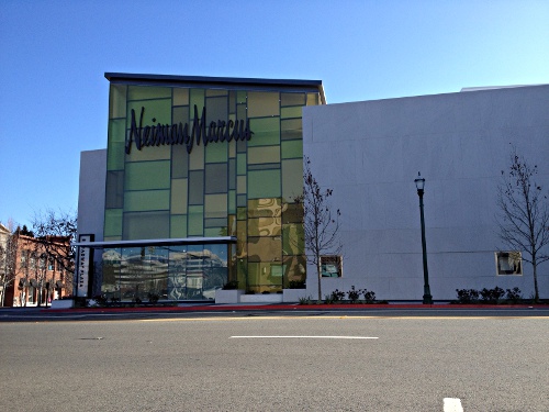
In a previous post about the new Neiman Marcus building in downtown Walnut Creek there were some complaints about the (Mt. Diablo view blocking) height of the building, as well as the size of the letters of the sign itself which might encourage over commercialism, so with the help of the Walnut Creek planning department I was able to track down the exact building heights and sign sizes of all three departments stores in downtown Walnut Creek.
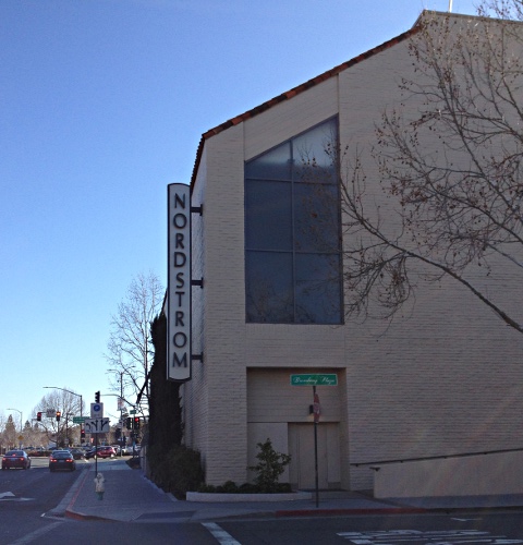
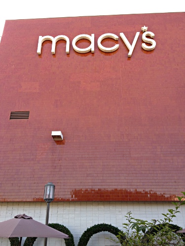
It turns out that as far as building heights are concerned, Neiman Marcus comes in at the lowest height of all, at 35 feet, and 47 feet high for the architectural element at the corner of Mt. DIablo Blvd. and N. Main St. Both Nordstrom and the Macy’s building height are 50 feet tall. The old David M. Brian building was 25 feet tall.
As far as sign size goes, the Walnut Creek planning department noted in an email that:
the wall mounted signs for Nordstrom vary in size from 19.5 square feet to 139 square feet. Each of the four wall mounted signs for Macy’s (women’s store) are 130.8 square feet, and the wall mounted signs for Neiman Marcus are 131.81, 172 and 268.9 square feet.
In this case the Neiman Marcus signs indeed are much larger than the other department store signs. Whether Macy’s and Nordstrom will petition to get larger signs installed remains to be seen.
Do these issues concern anyone? Are you happy with how Neiman Marcus turned out? Personally I think it looks cool from a design standpoint and am relieved it’s not a rectangular box like department stores tend to be.
See Nordstrom and Macy’s building photos after the jump

Walnut Creek Nordstrom sign

Walnut Creek Macy’s sign
