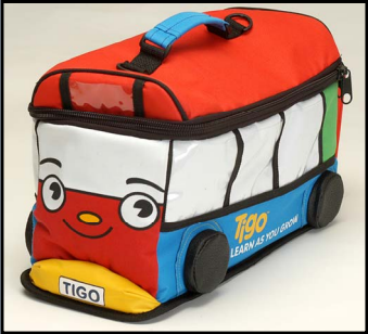
Be on the lookout for a toy that looks like a bus as pictured above. In 2007, they were handed out in Antioch, Bay Point, Concord, Pittsburg, Richmond, San Pablo, Martinez and Brentwood, but may have ended up in Walnut Creek and Lafayette. From an email:
Dear Beyond the Creek,
I would like to alert you to a lead contamination health crisis here in CCC involving toys containing up to 2100 ppm (which is 21 times the current federal limit).
This situation was not reported to the general public here in Contra Costa County, CA, and as the danger remains, I feel the public has a right to be more fully informed about the matter. Moreover, it seems that the agency violated the federal Consumer Product Safety Act, which requires that any distributor of hazardous toys involving a recall is required to immediately report it to the Consumer Product Safety Commission. They admittedly did not do that, nor did they report it to the State of California public health officials, and it’s not confirmed that they actually informed our county’s lead poisoning office, which may be required by law as well.
Read the rest after the jump
